Newsprint Graphic for Sable.ny
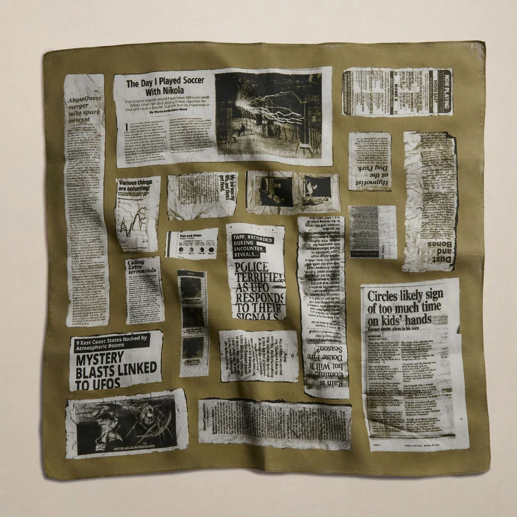
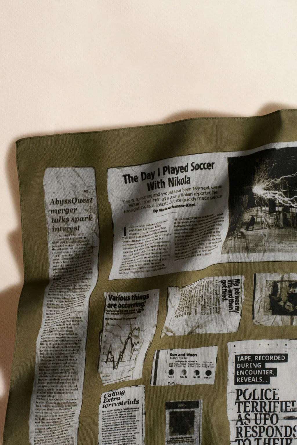
Sable.ny, an emerging accessories brand, commissioned a custom vector graphic for a new cotton bandana. The client requested a newspaper motif on a khaki green background but left the layout and specific content entirely open. I designed a pattern that evokes the modern experience of being inundated with absurd, fake news, presented as vintage newspaper clippings.


Takeaways
Creating this graphic was extremely labor-intensive, but I am proud of the result. While newsprint is a common pattern, I haven't been able to find anything else utilizing this specific clipping or halftone concept.
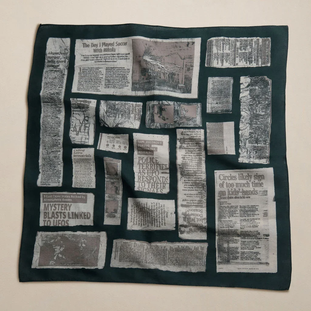
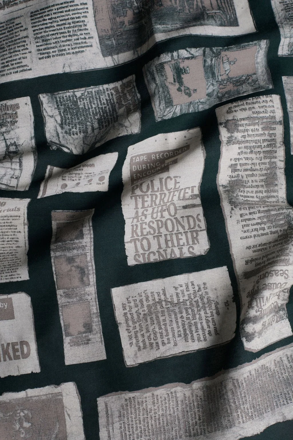
I was thrilled with the original khaki colorway. However, for the second colorway, a forest green with reddish-gray, doesn't quite achieve the same visual illusion. While this combination is extremely wearable and pairs well with outfits, what should be the darkest tone ends up reading as the mid-tone.
This project underscored for me the importance of the designer having a direct line to the fabricator. This was a complex design that went a lot smoother once I could communicate directly with the print shop.
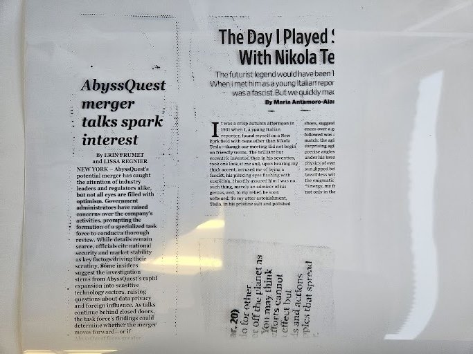
This screen test print was sent to me from the printer.
Example Created Graphics
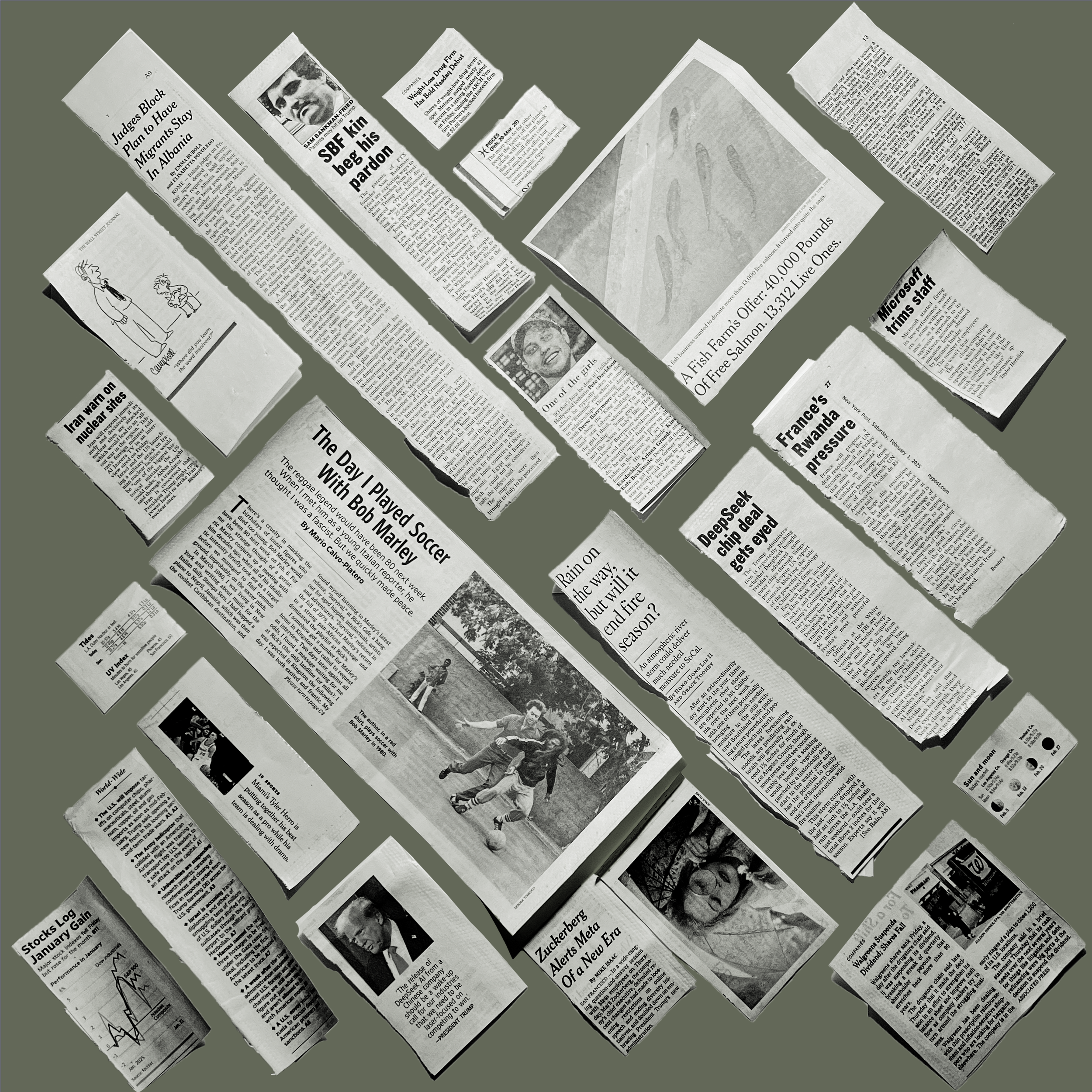
To bring this concept to life, I wrote 20 unique stories and mapped them to the exact layouts of scanned, crumpled newspaper clippings. My goal was to replicate the authentic, textured look of traditional halftone printing. This presented a unique technical challenge: the manufacturer required scalable vector artwork, a format inherently designed for flat, solid blocks of color rather than complex print textures.
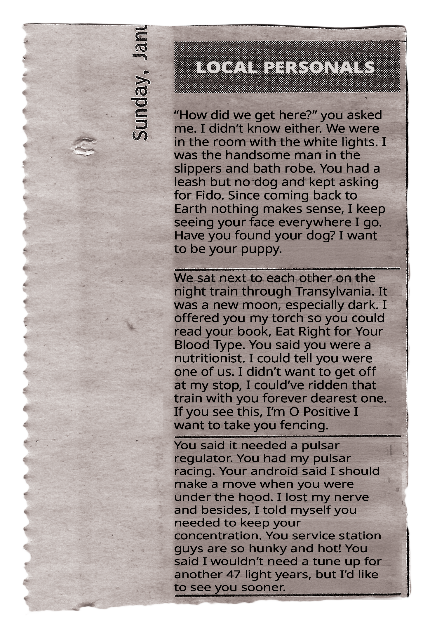
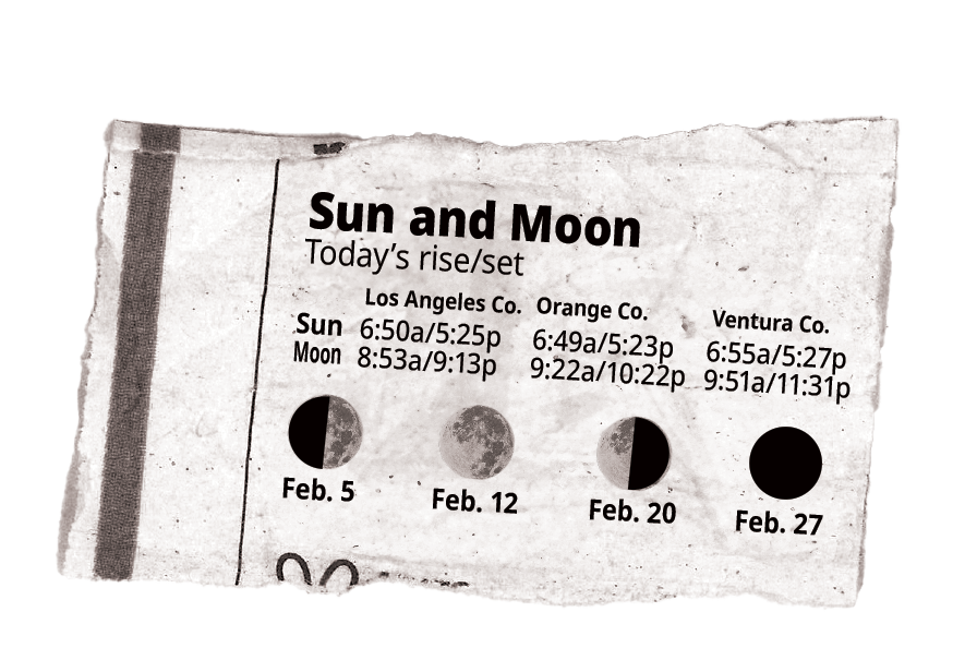
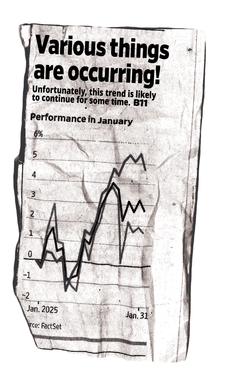
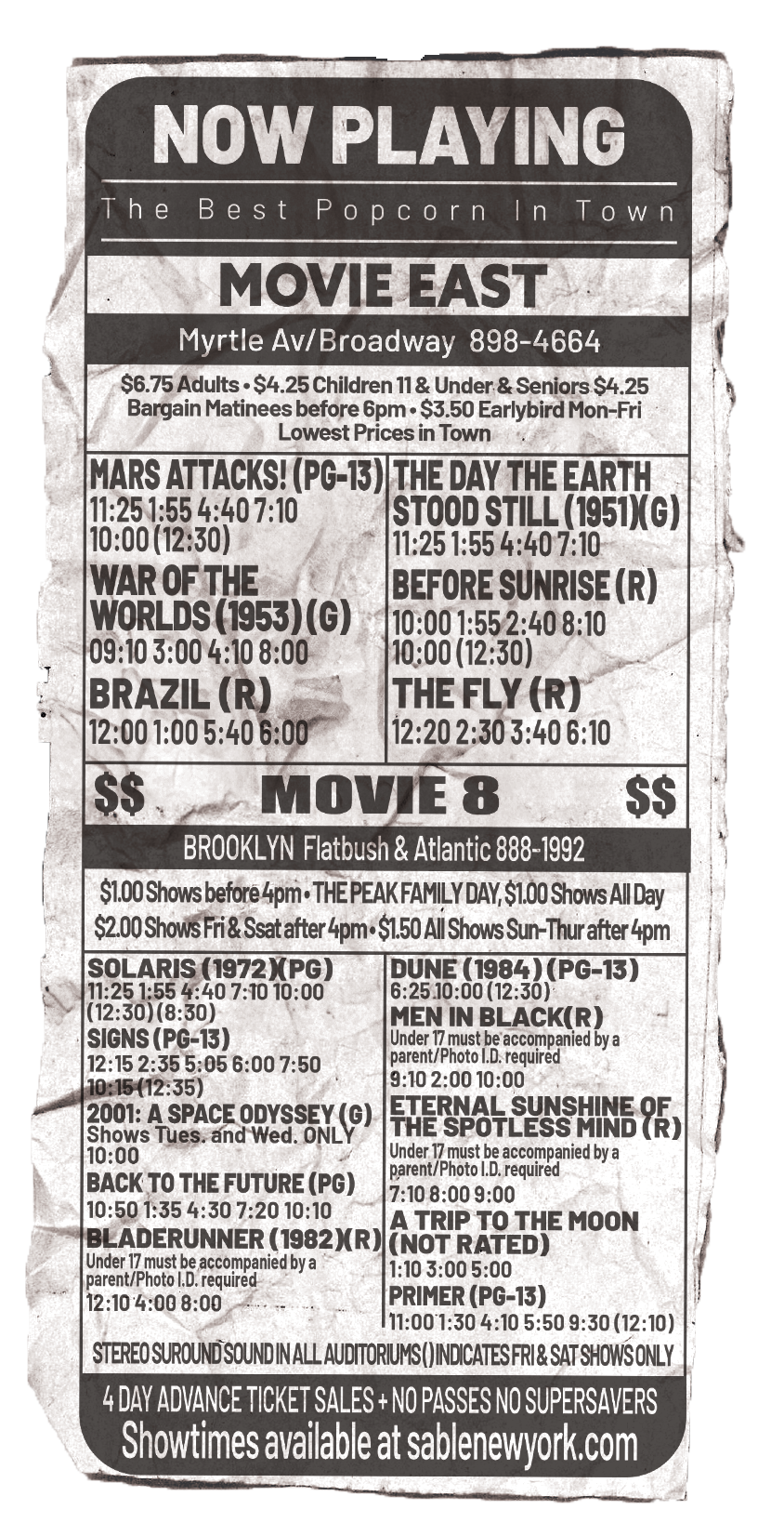
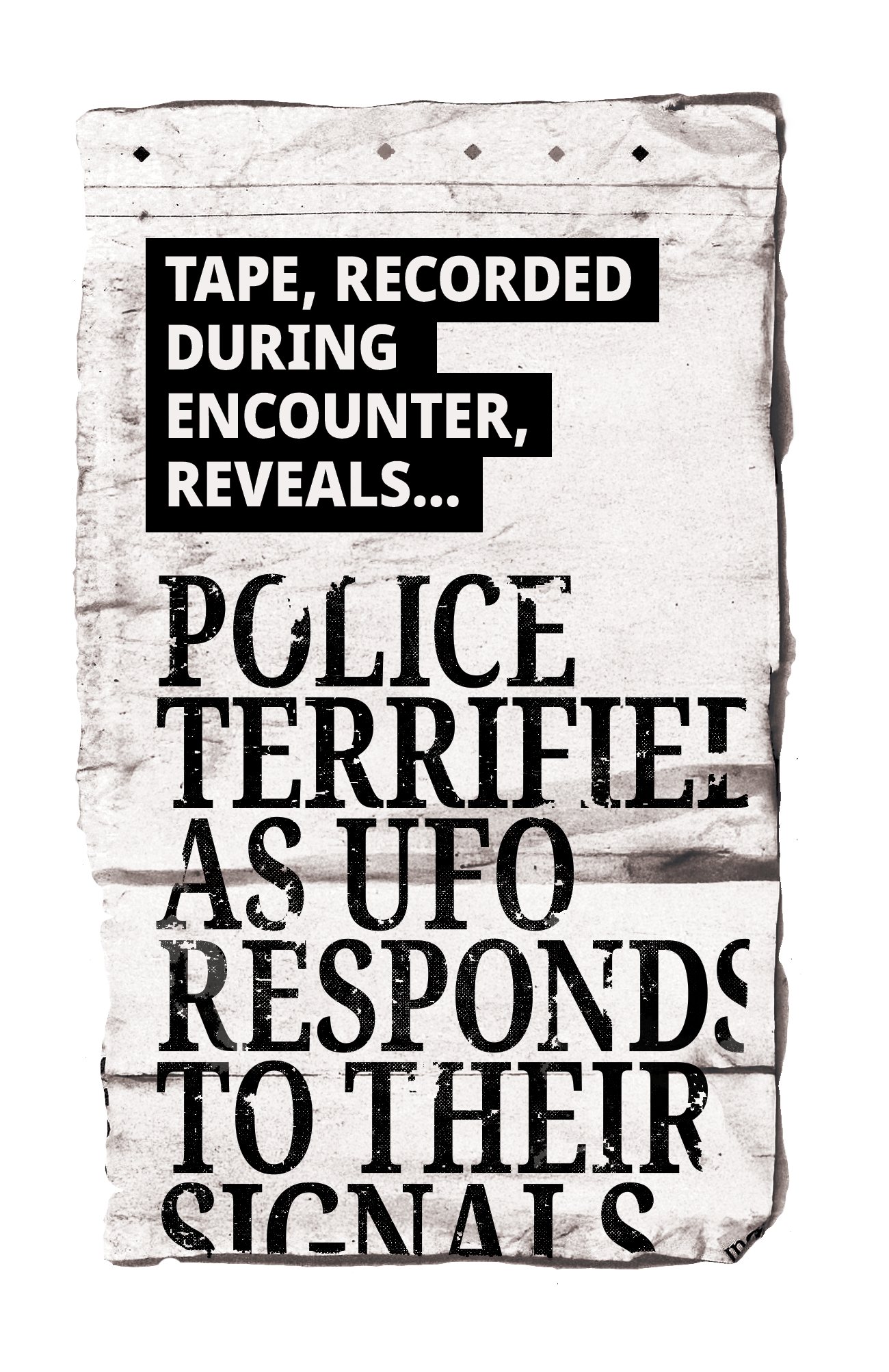
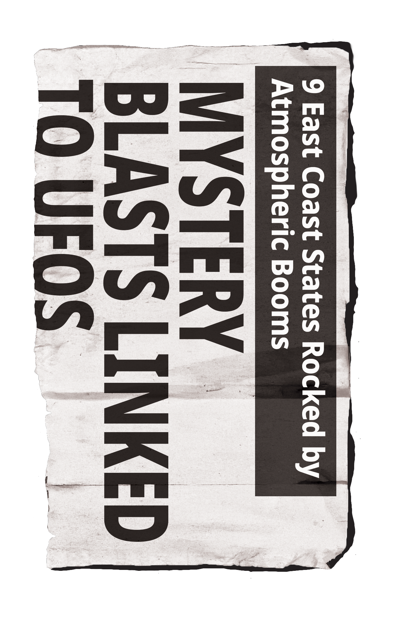
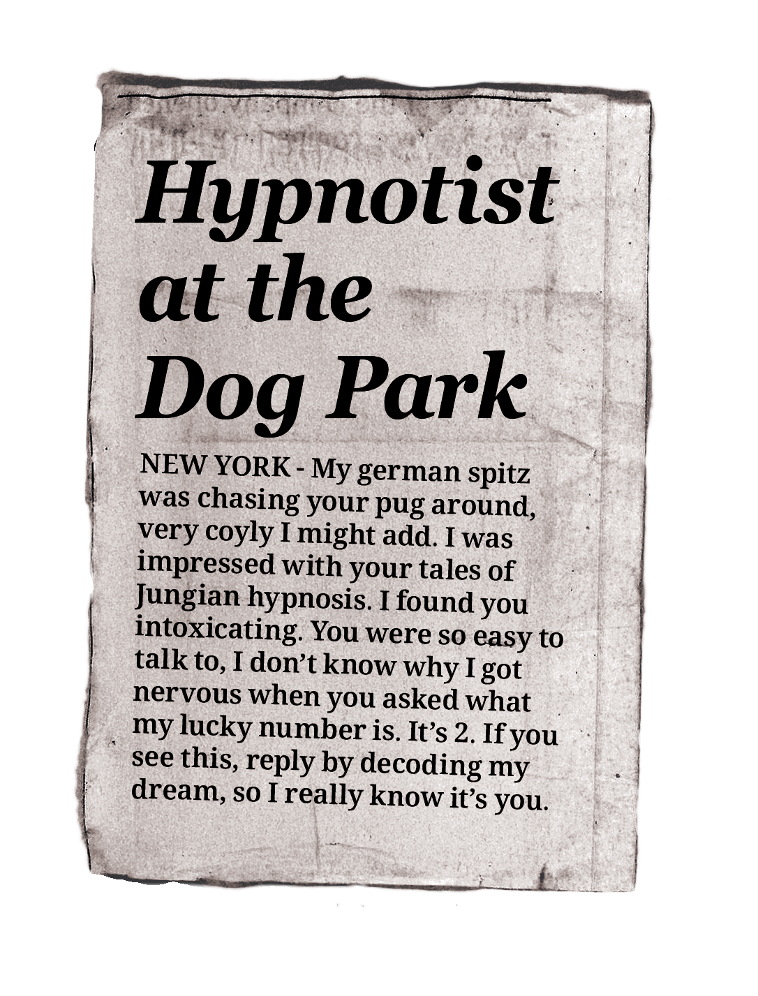
Halftone scale, density, and alignment experiments
I removed the original text in Photoshop, incorporated public-domain images with my custom copy, and converted the files into separate black-and-white screens. Using a specialized web tool, I translated the images into scalable vector halftone dots. This highly experimental, cross-platform workflow between Photoshop, Illustrator, and web tools made it incredibly rewarding to finally crack the code. The final design maintains an authentic halftone texture while ensuring the typography remains fully legible and the drop shadows provide realistic depth. The client was so thrilled with the result that they expanded the production run to include a second colorway.
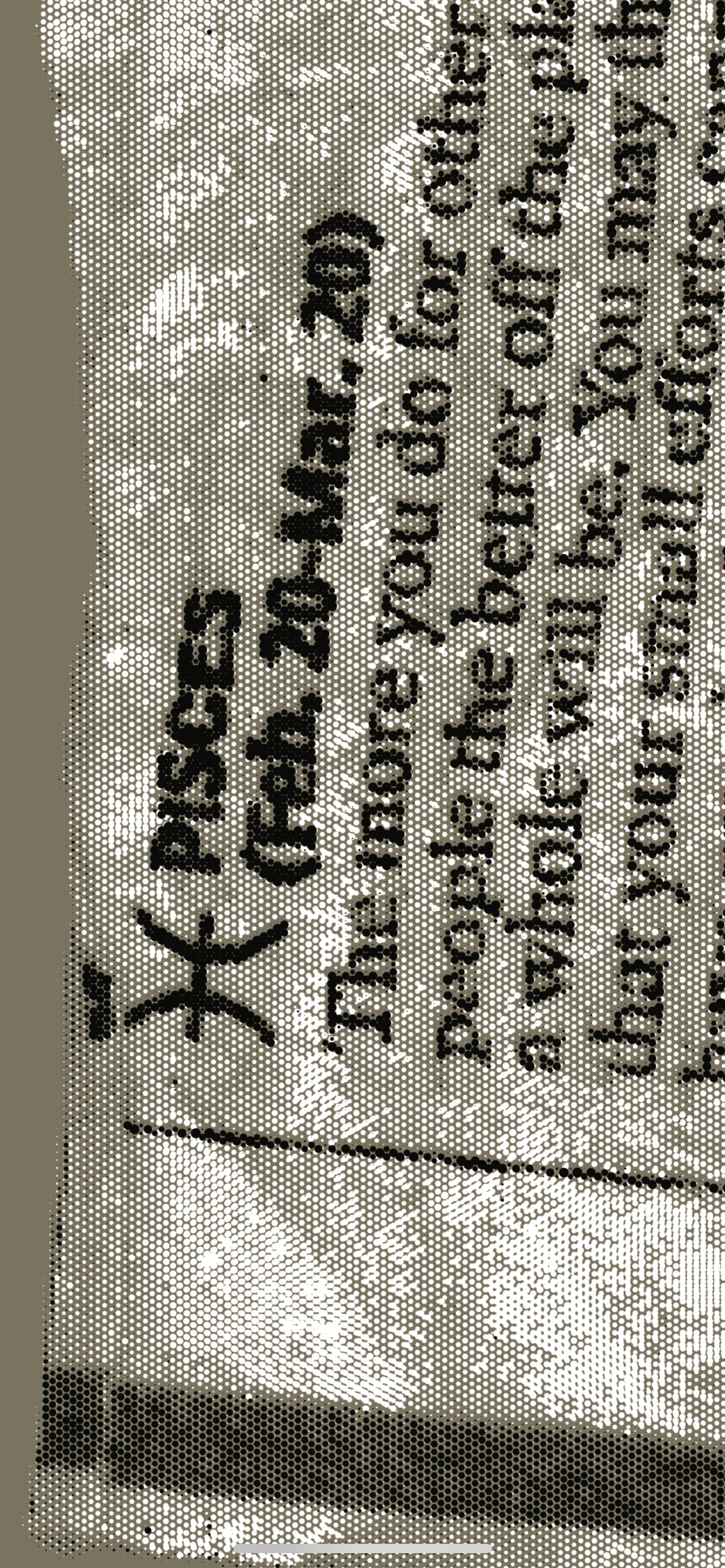
Halftone text
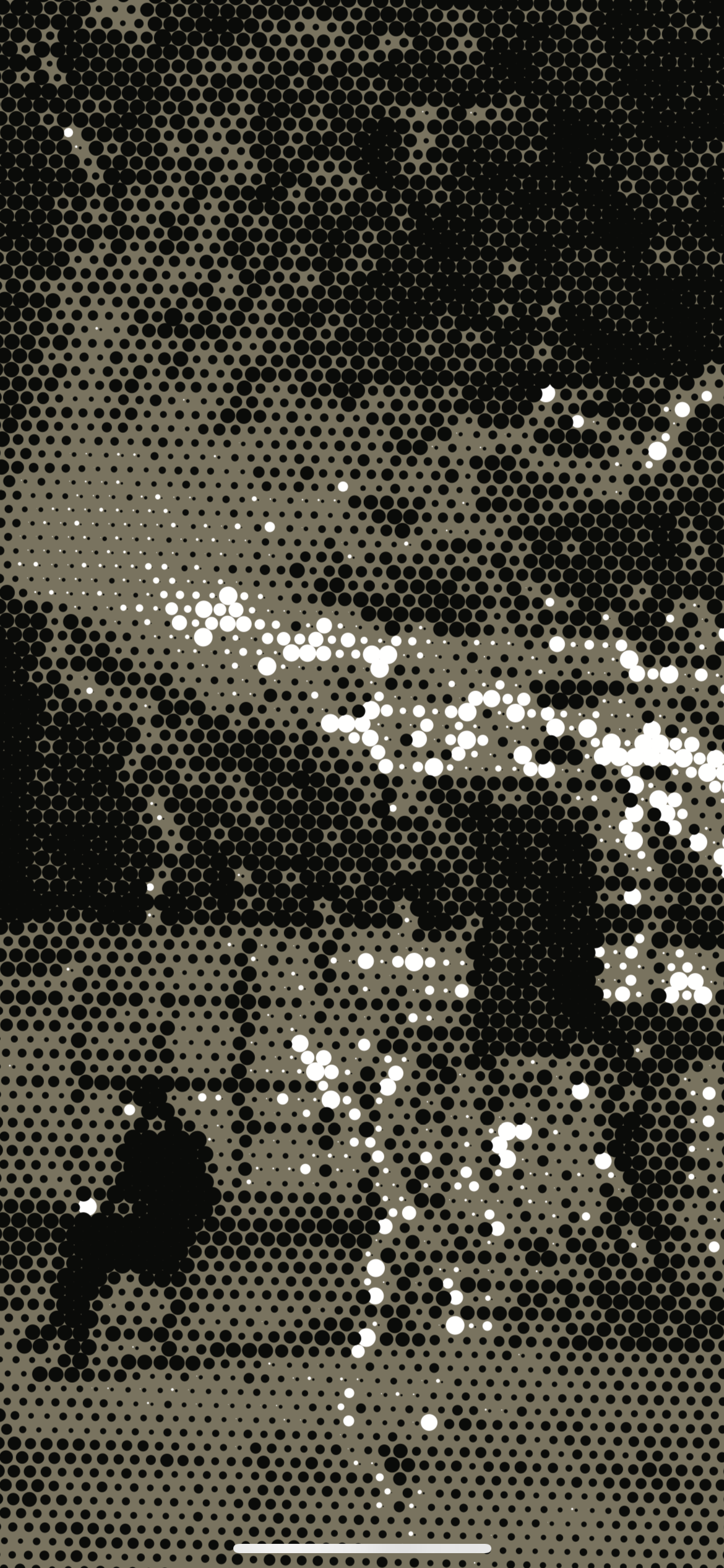
Larger dots
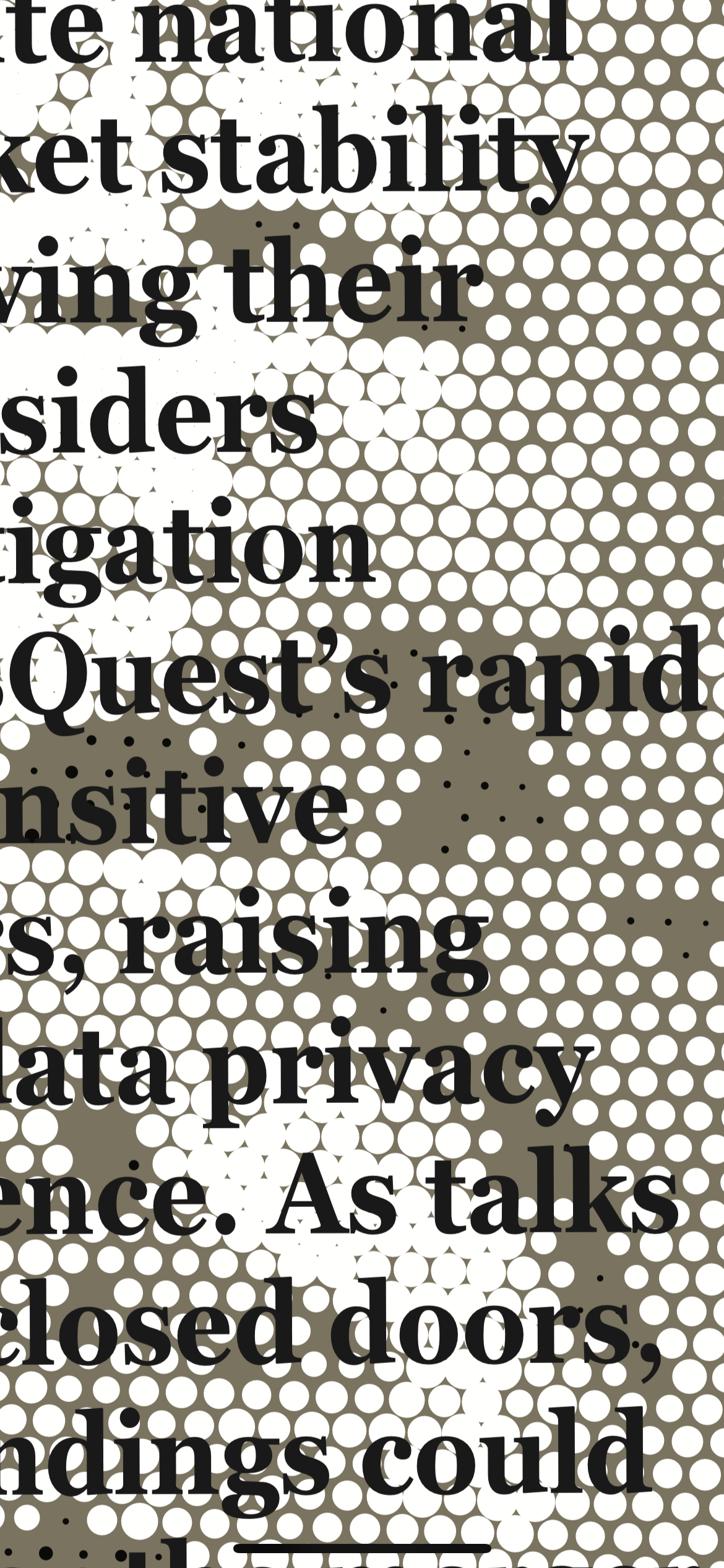
Non-halftone text
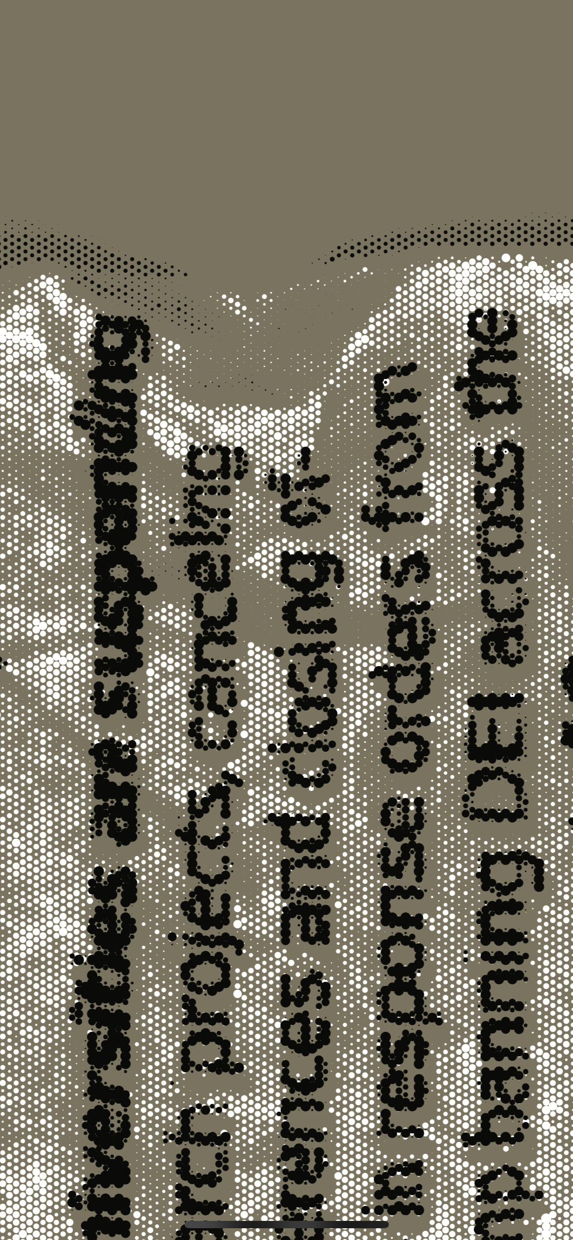
Slight misalignment
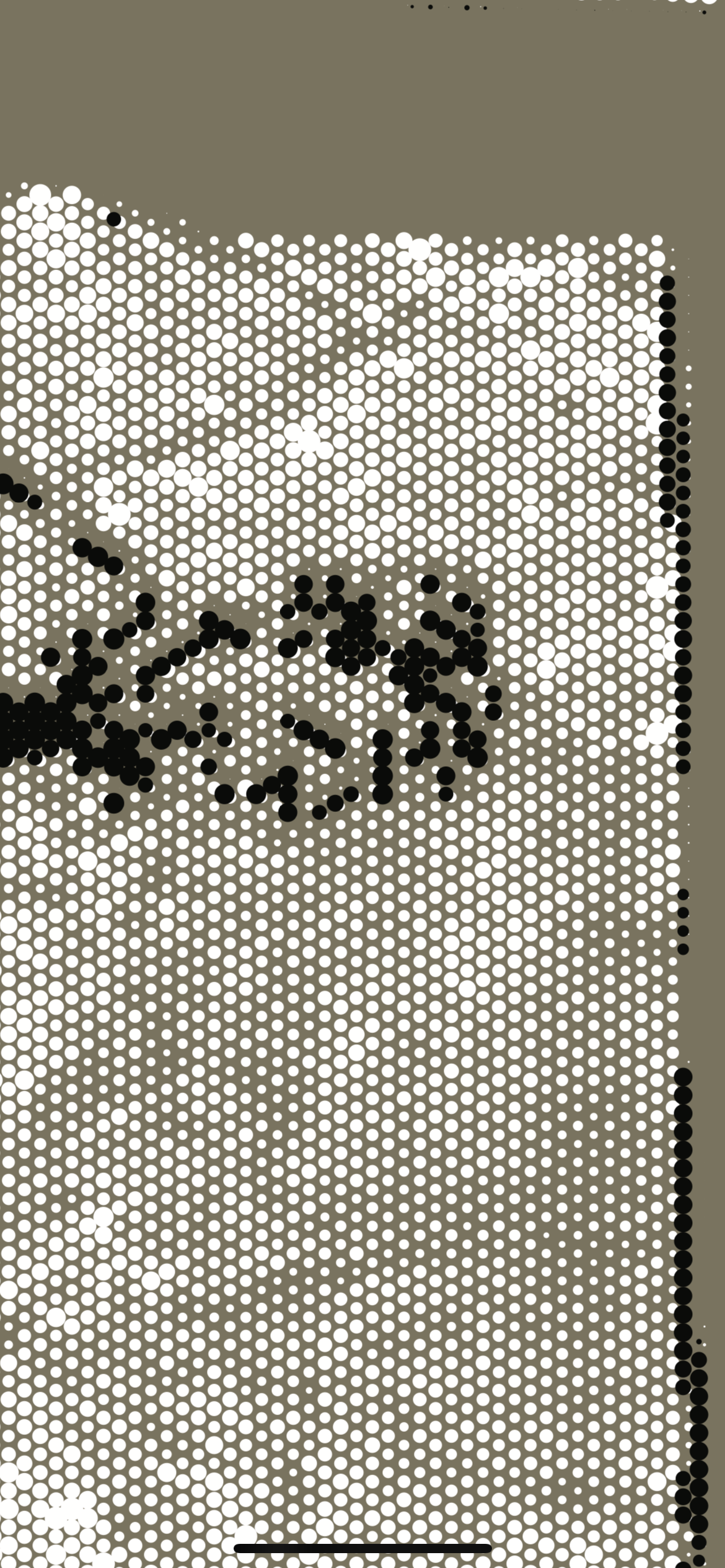
Linework
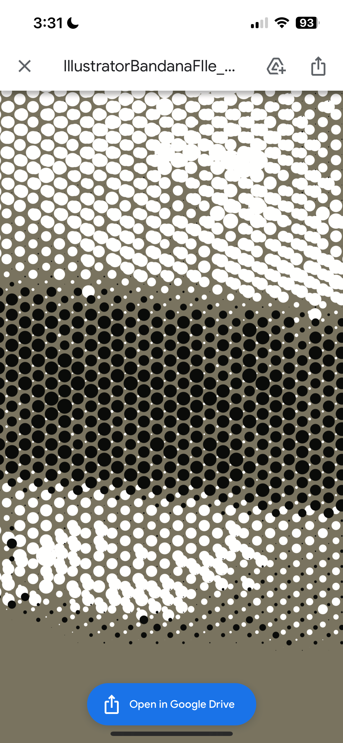
More variation in dot size, overlapping dots
Early Layouts
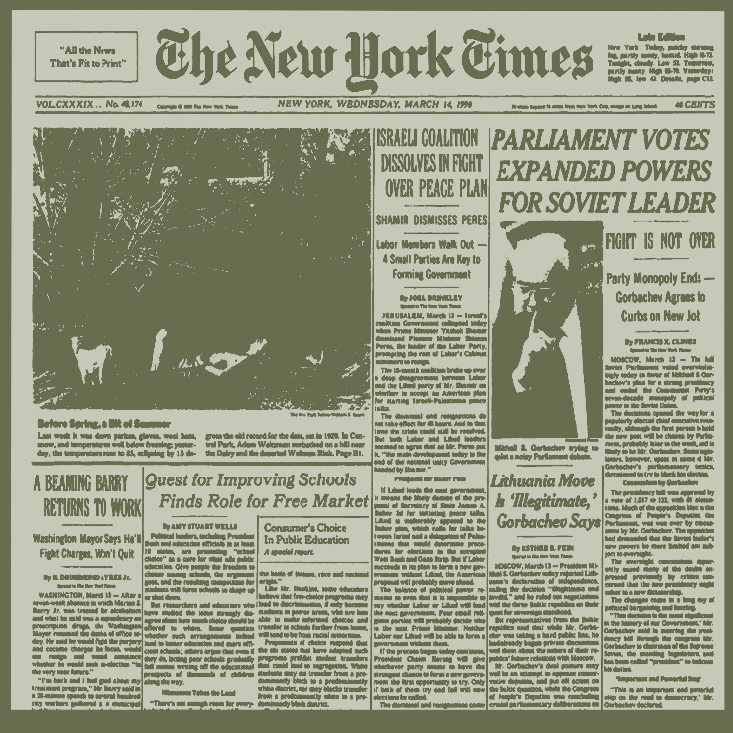
Single page, flat
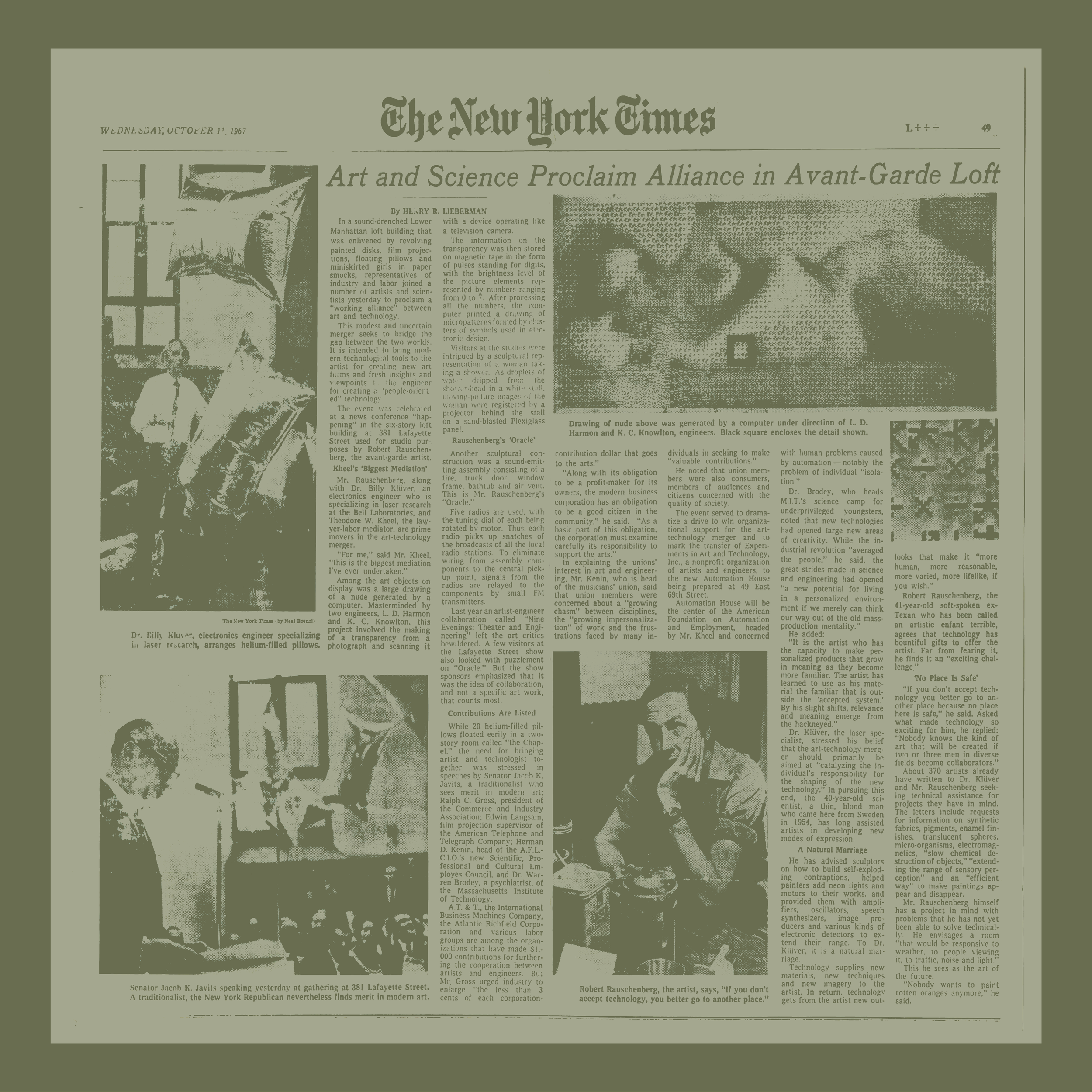
Single page, inset
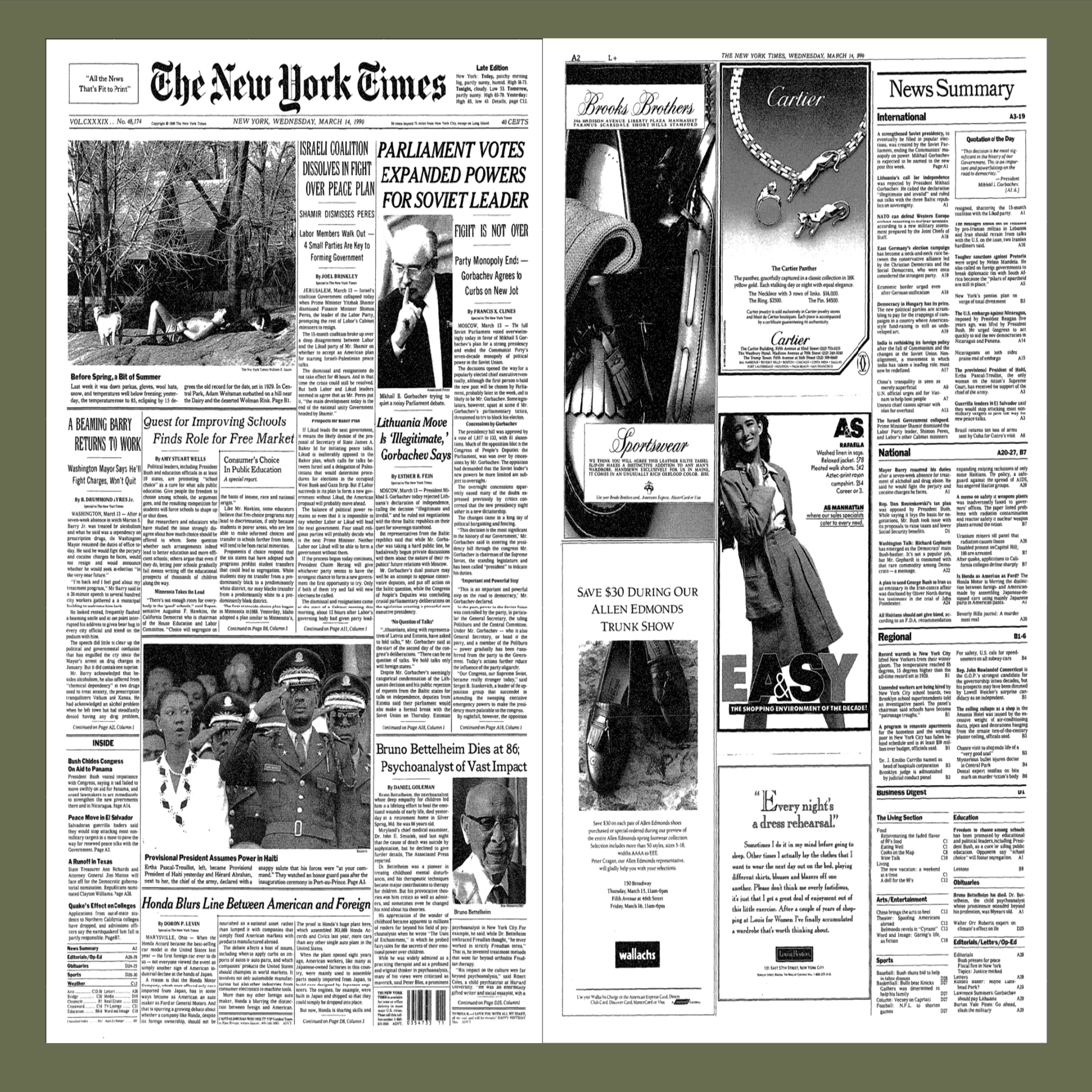
two full pages
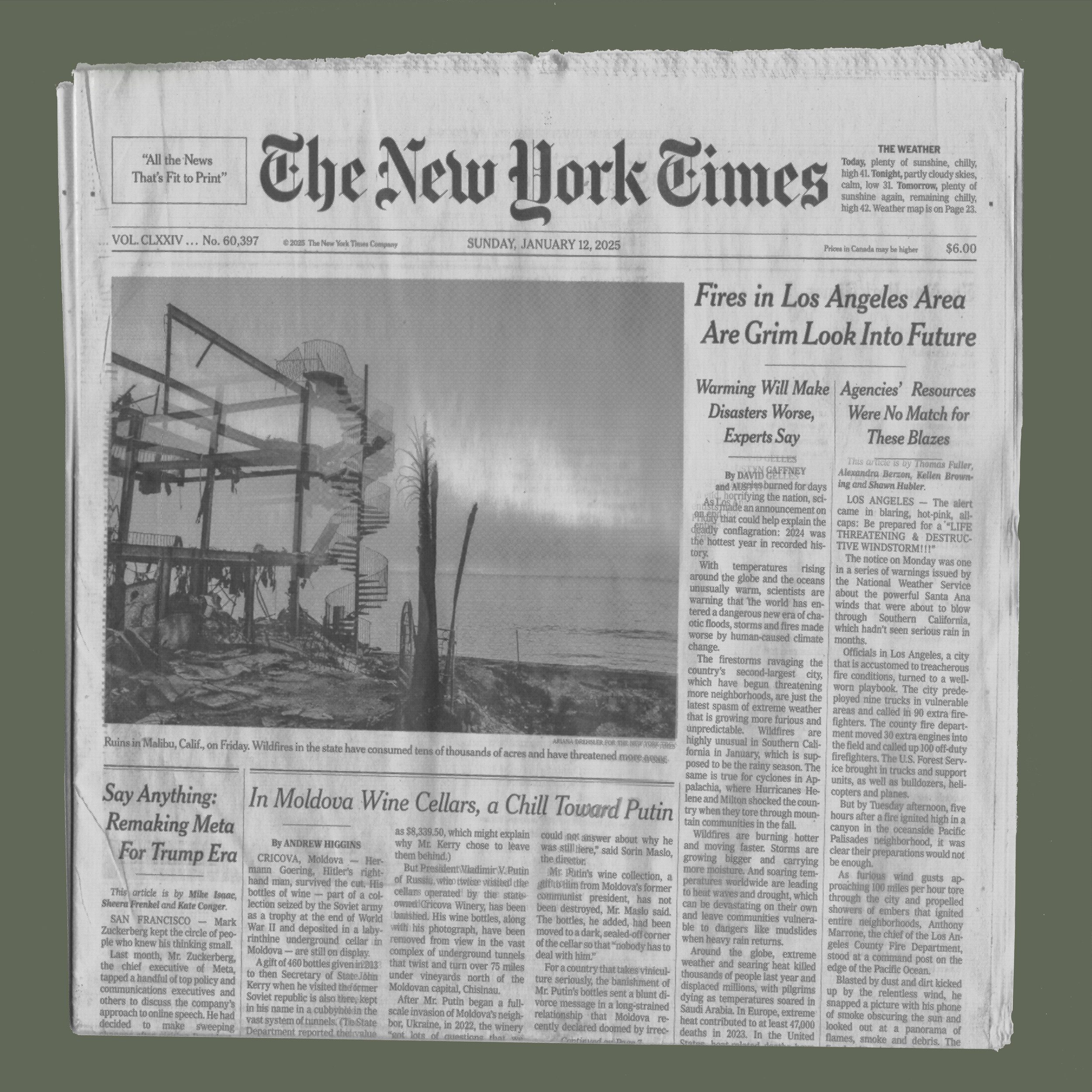
Dimensional front page
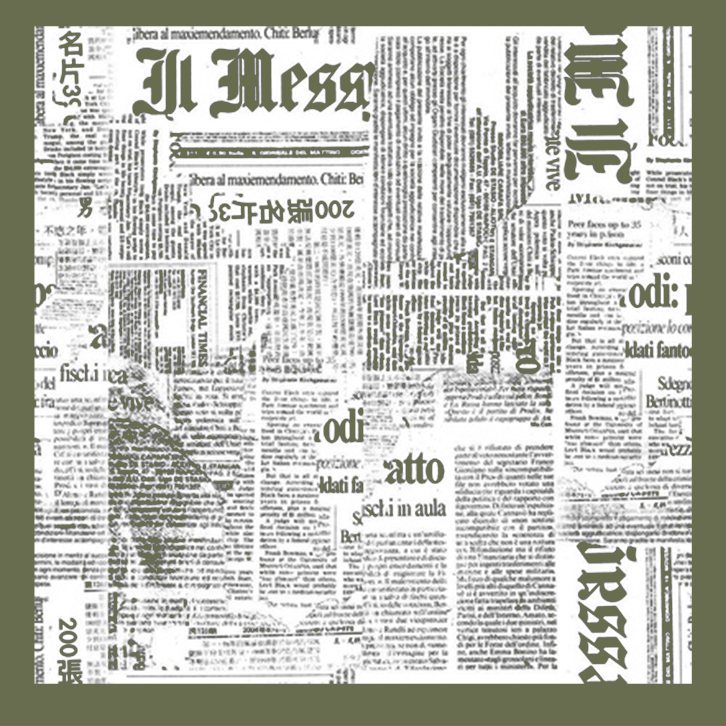
Abstracted
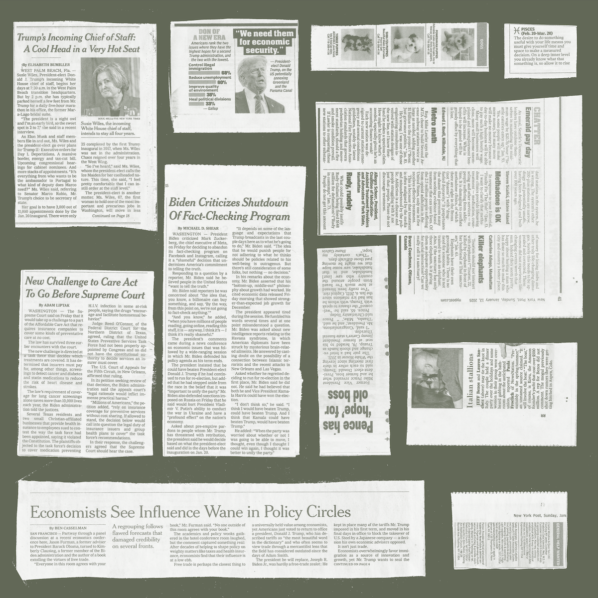
Clippings
Should it be 1 color or two?
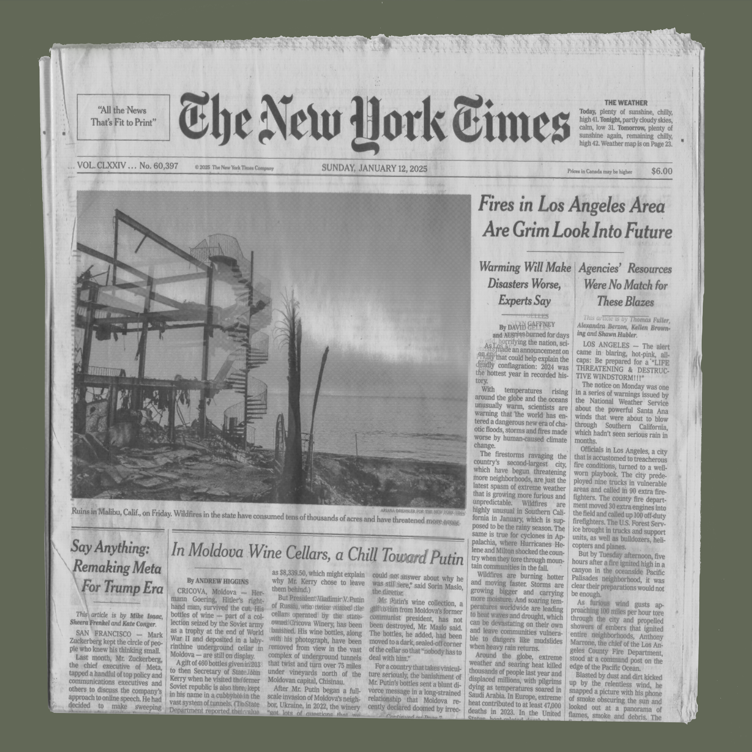
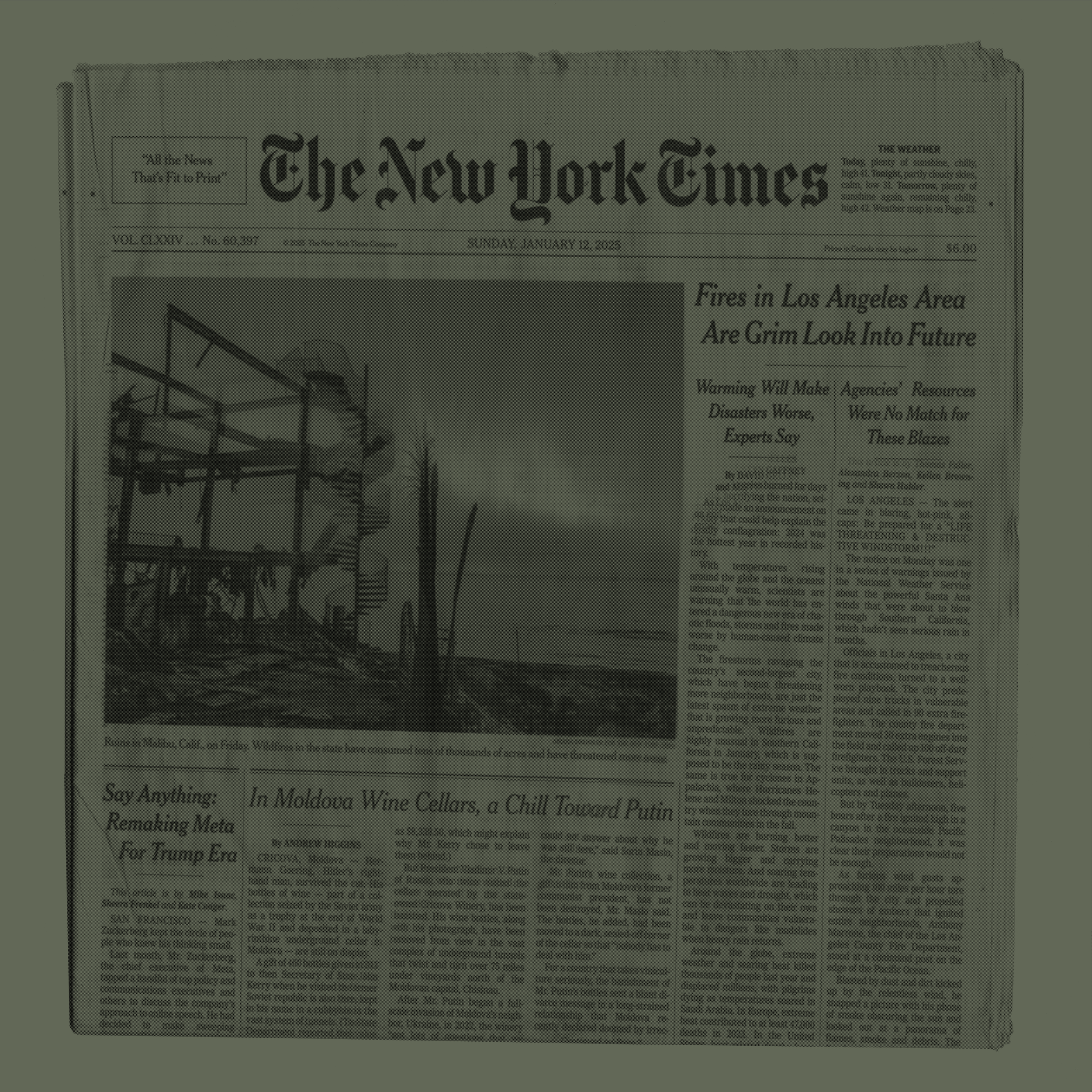
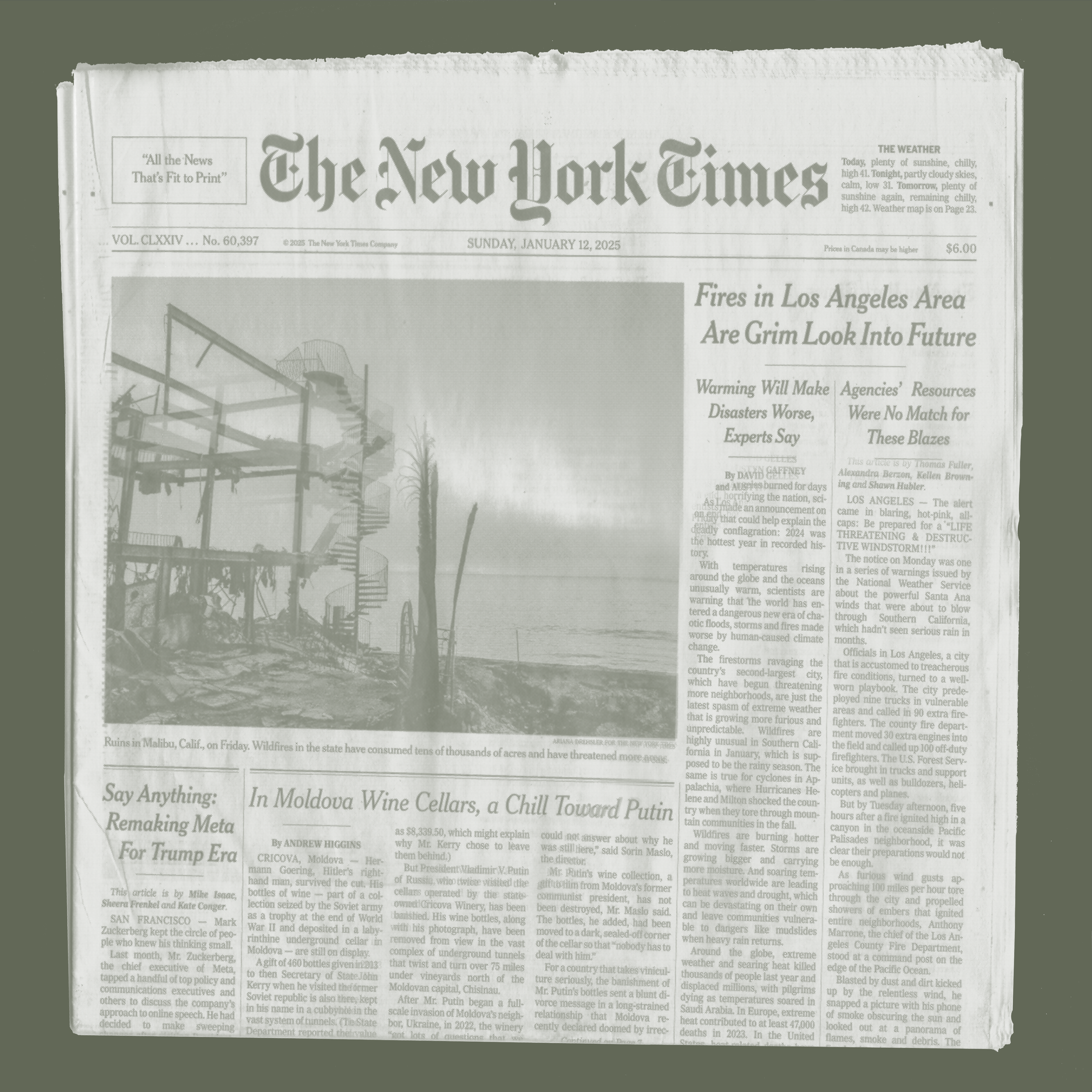
Clipping Layout Explorations
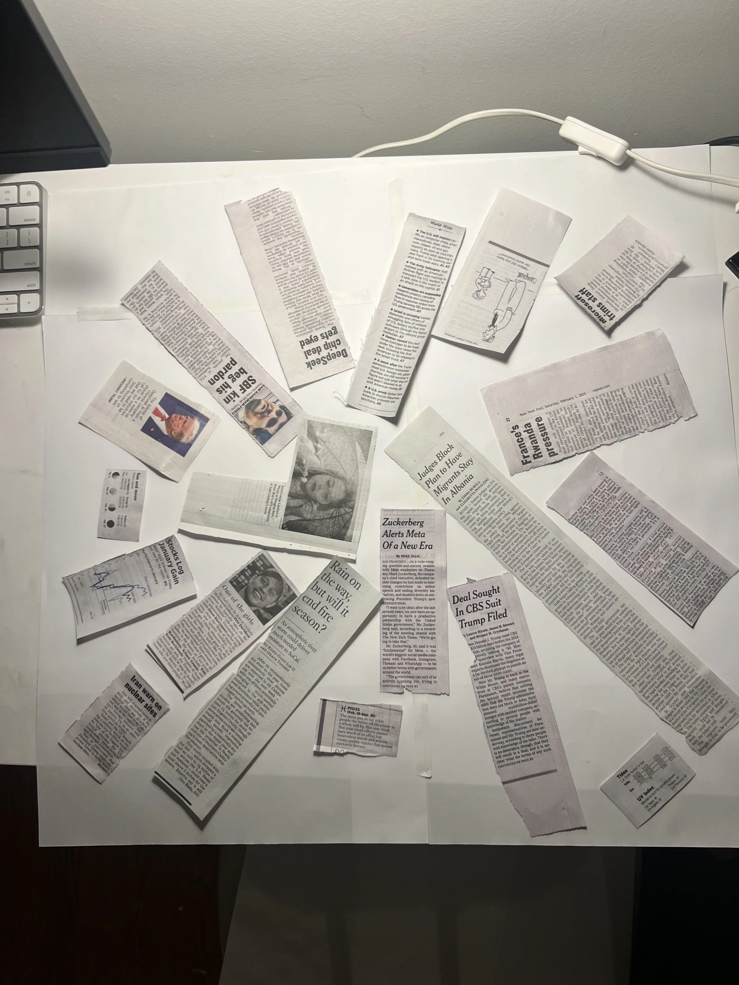
Converging
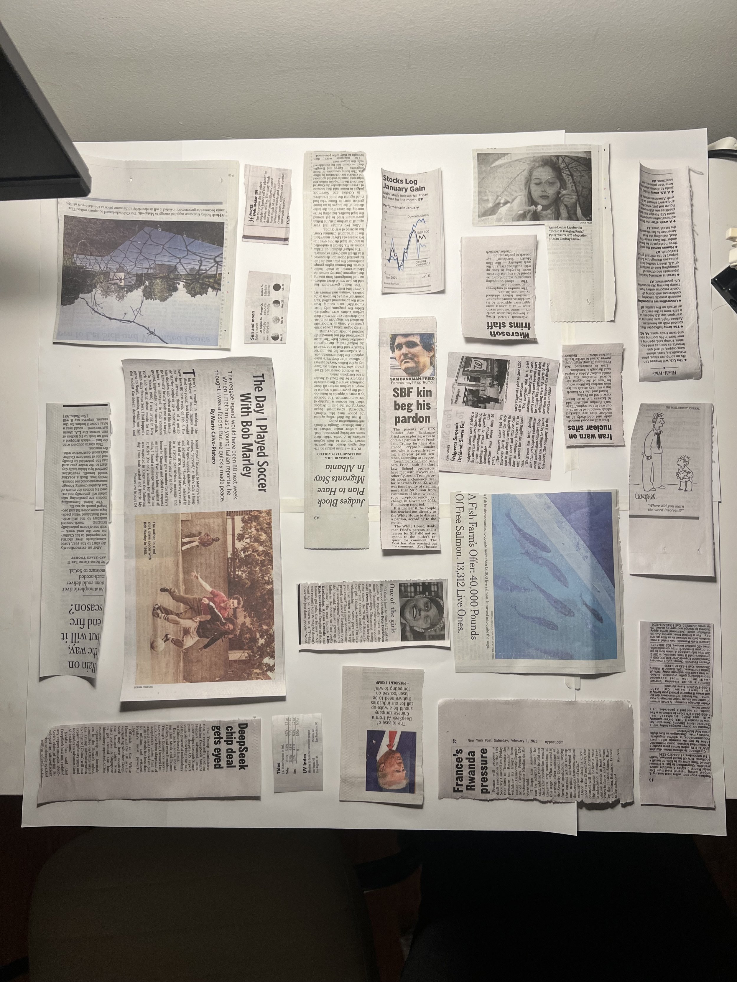
Square
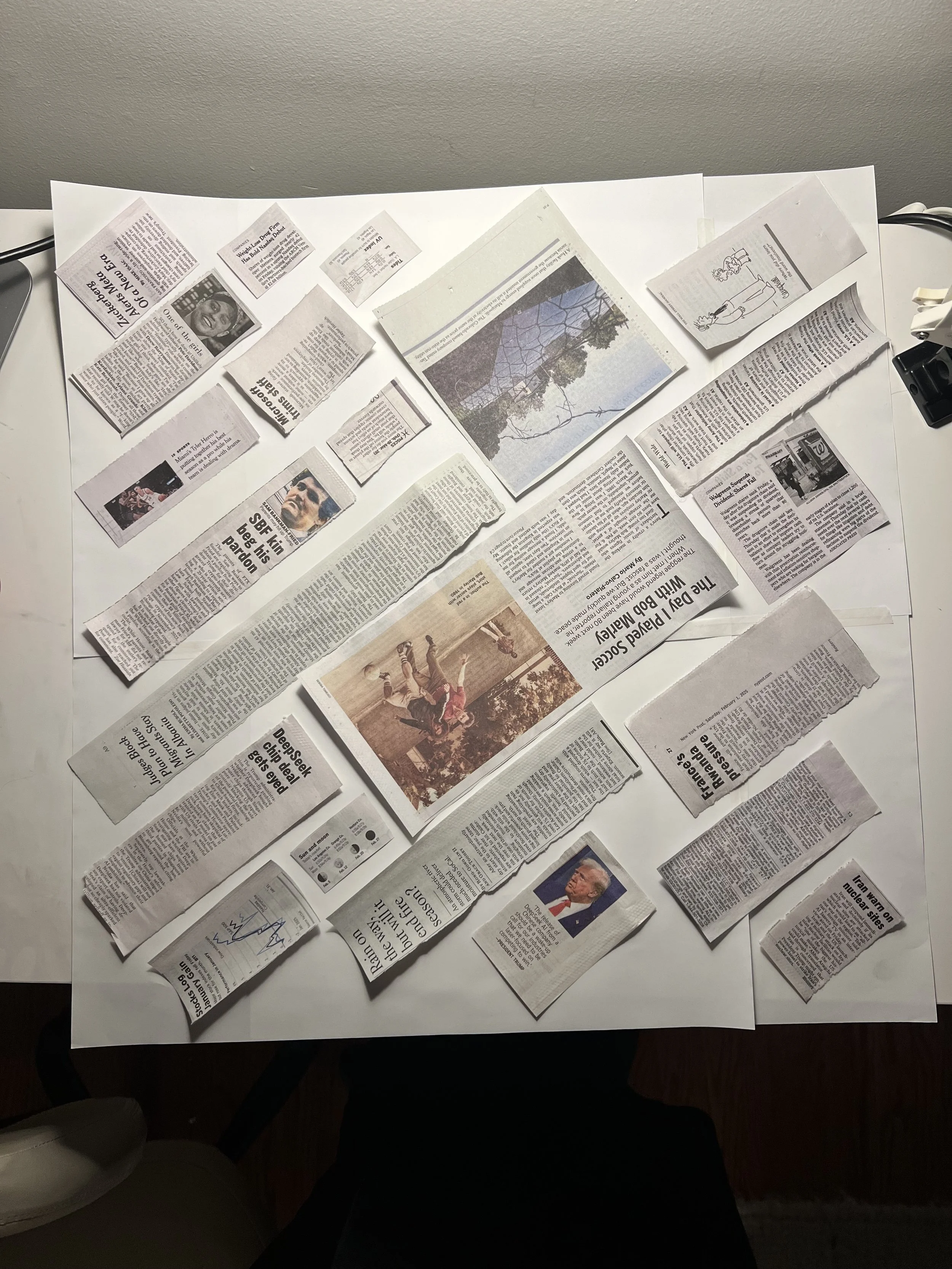
Diagonal
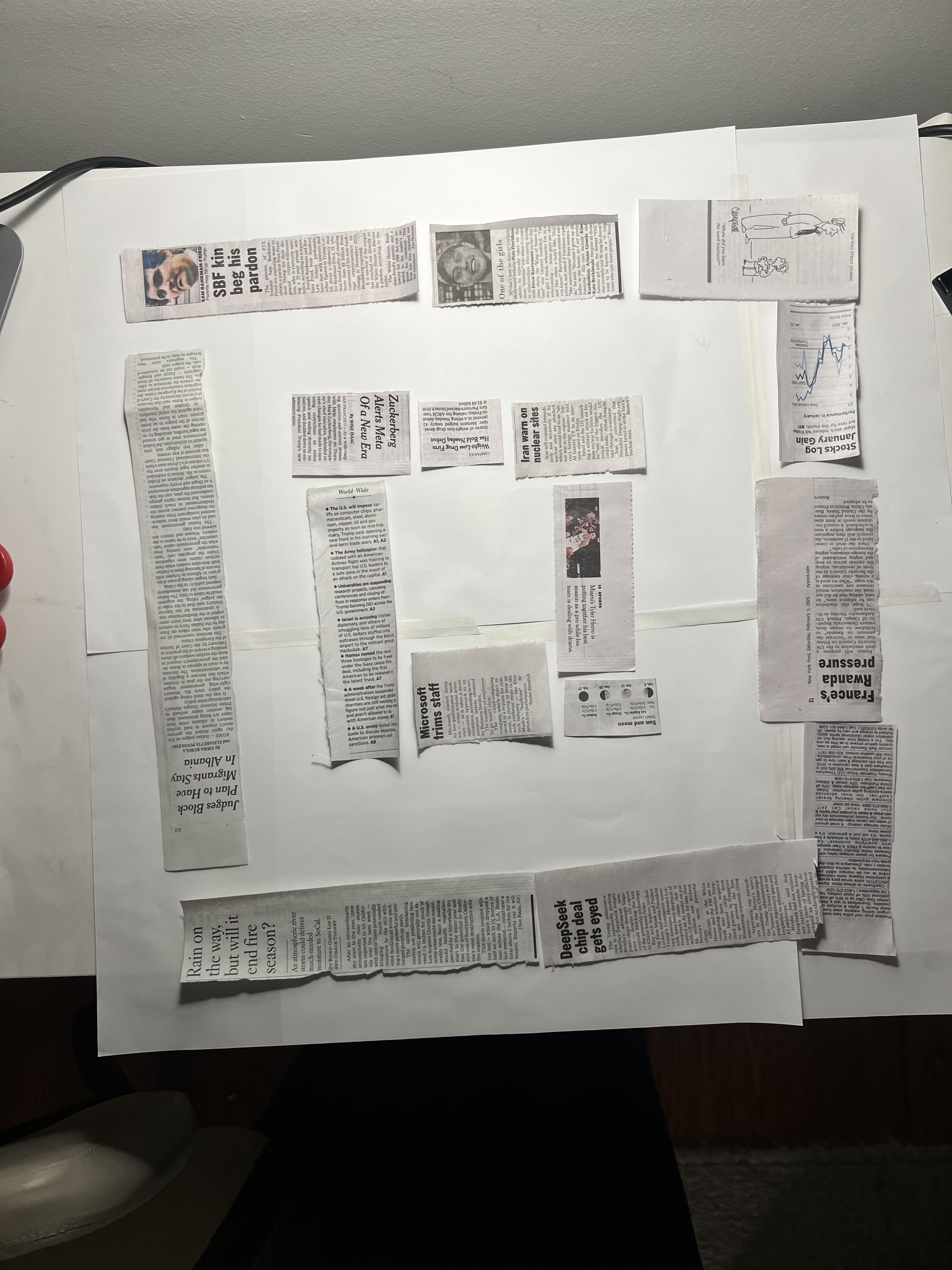
Concentric
In-Progress Images
Diagonal layout with real articles cut out of newspapers
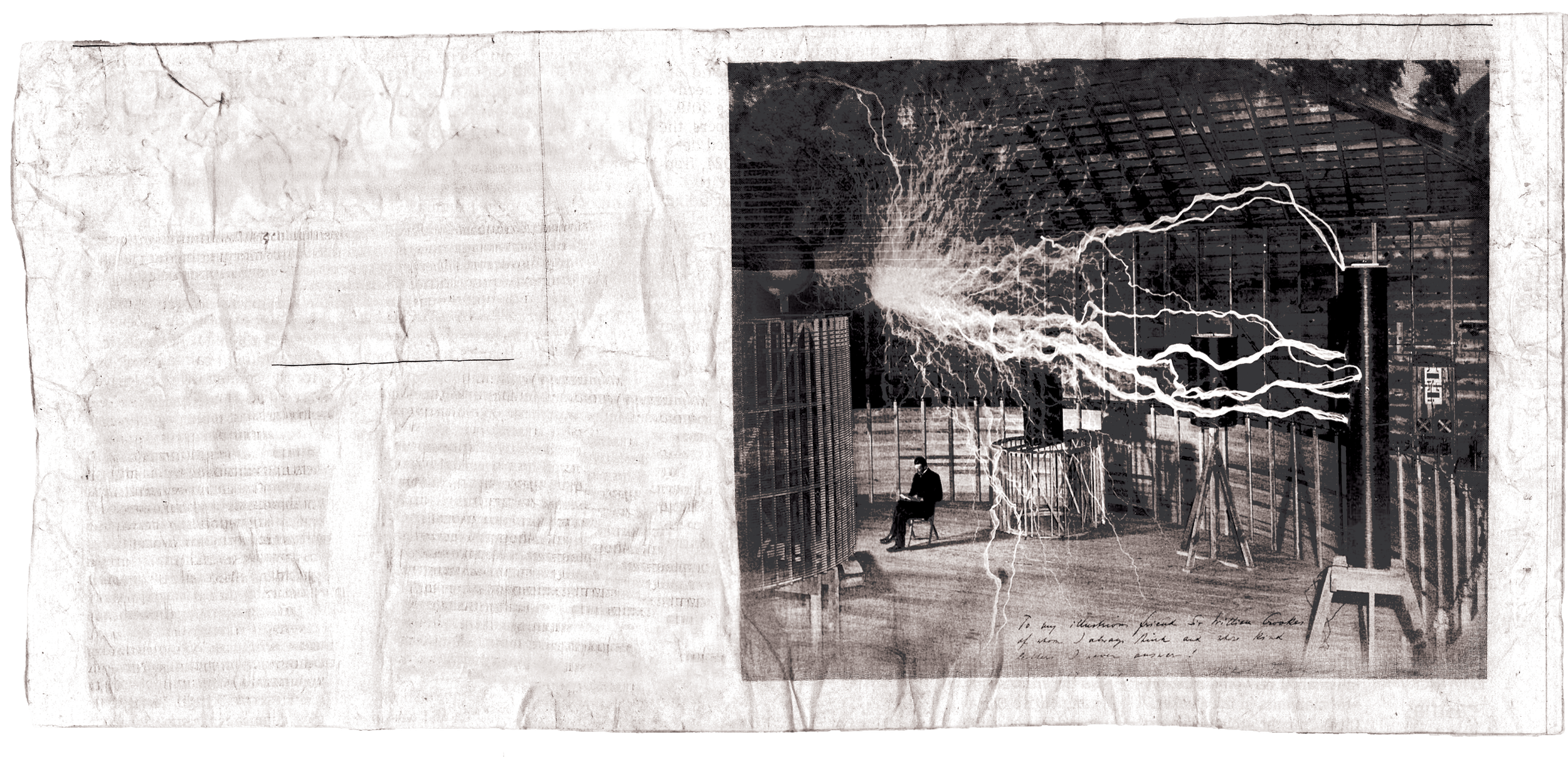
Article with removed text and open source image.
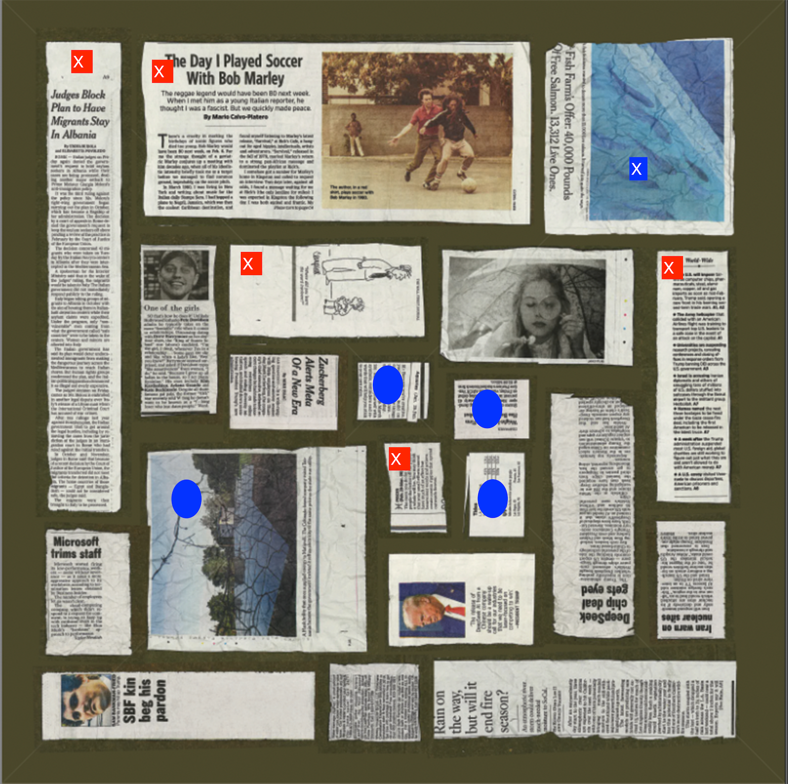
Square layout with articles marked for replacement
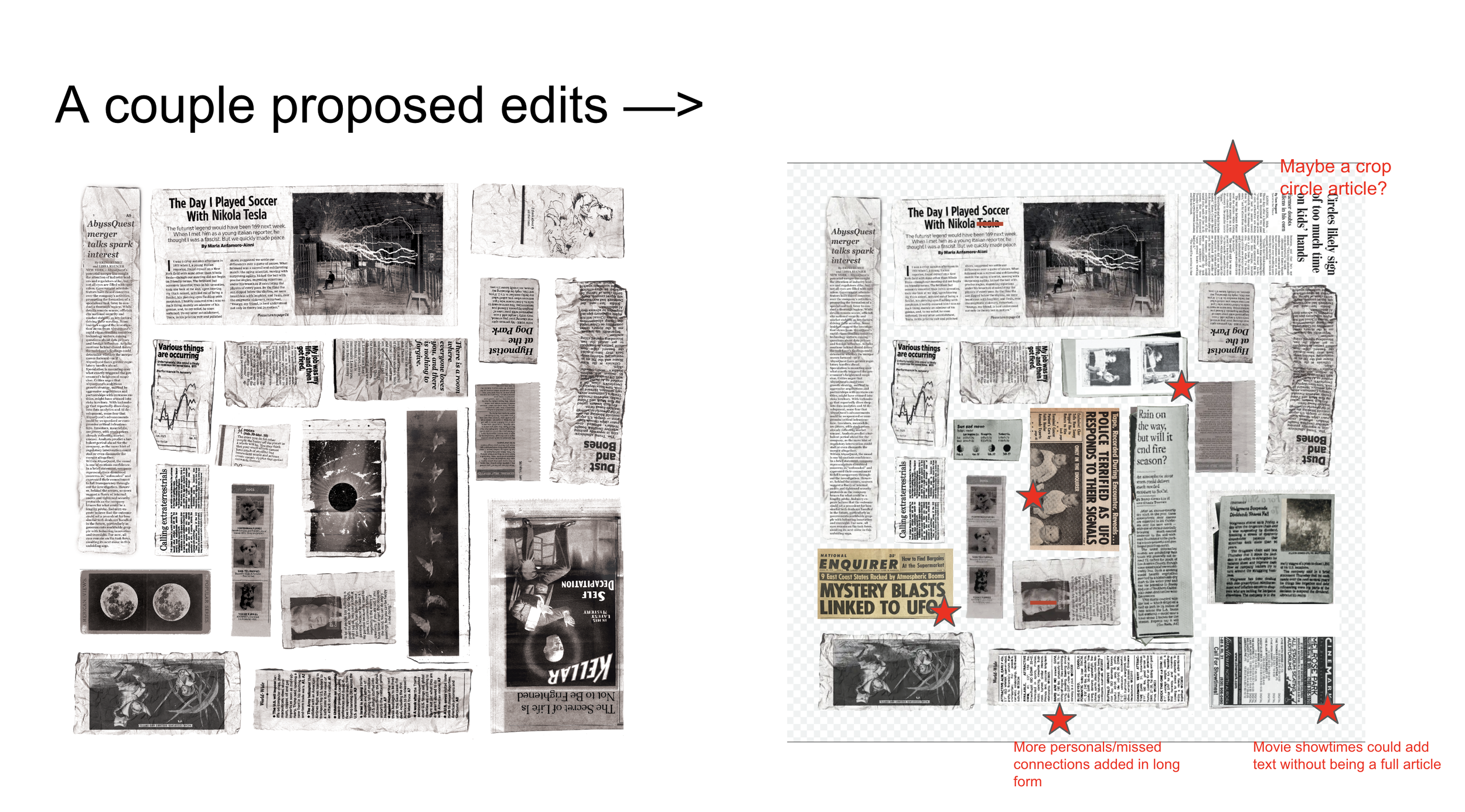
Client edits
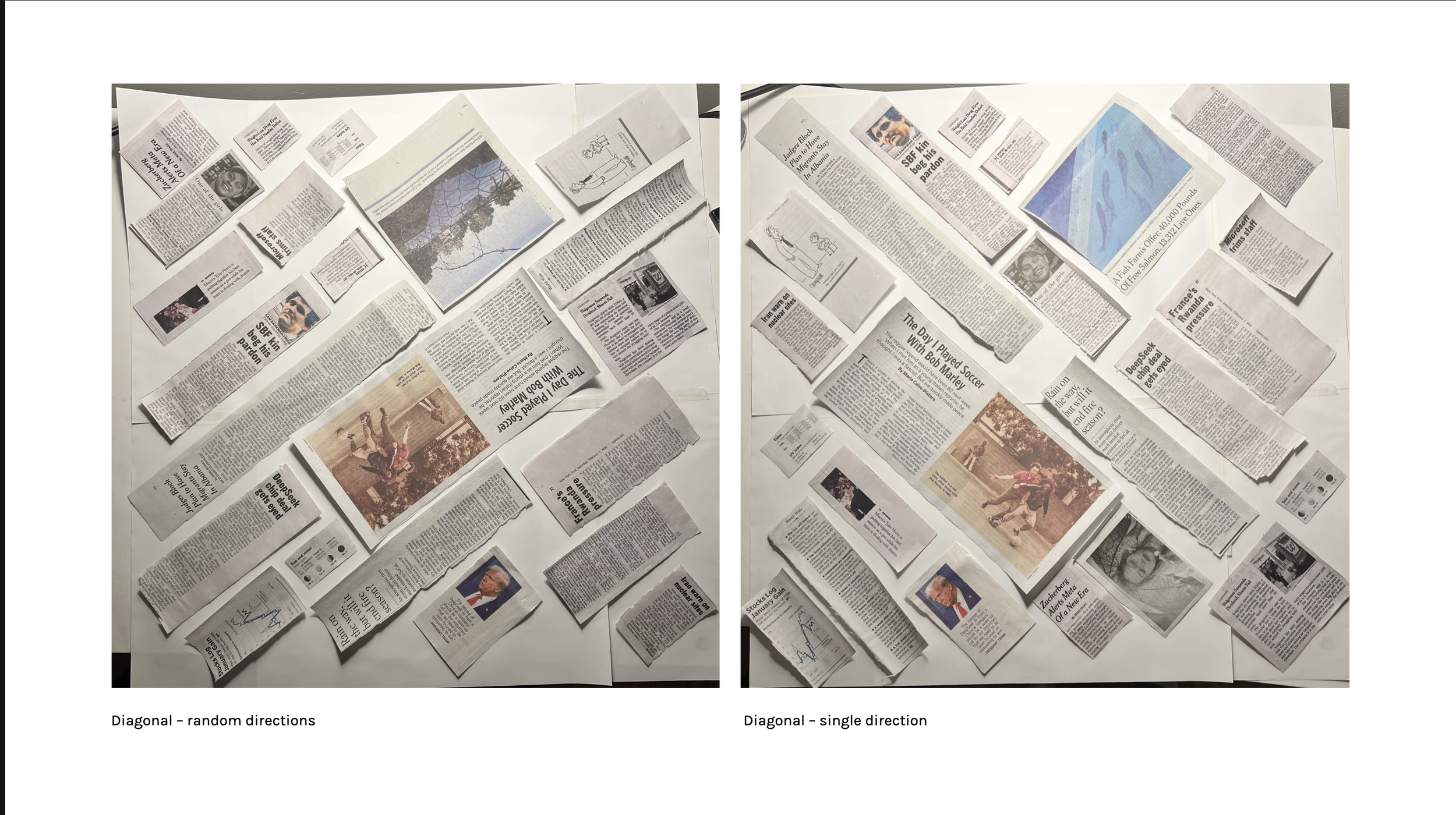
Diagonal layout showing all the articles facing the same direction vs different directions
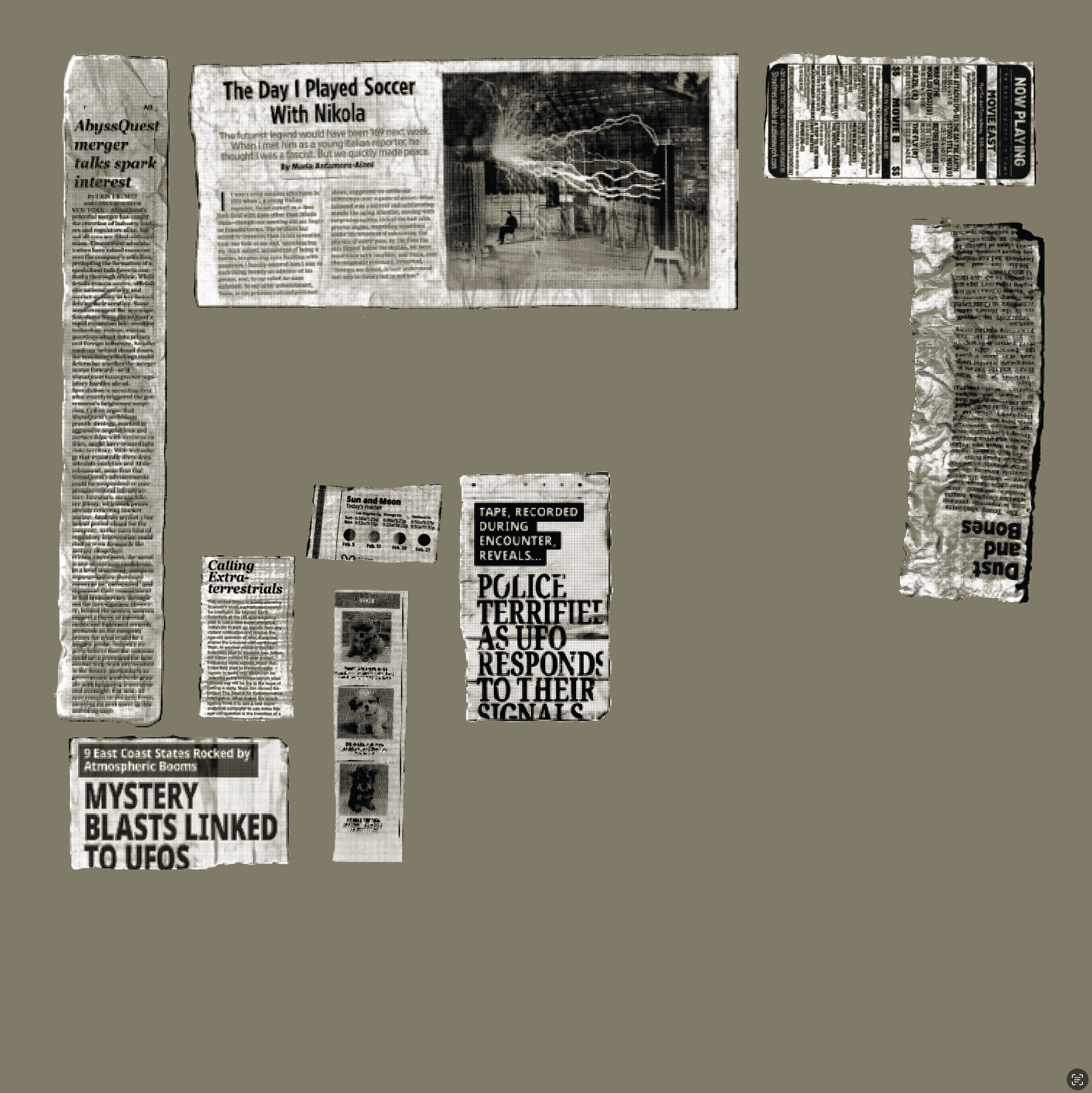
Articles had to be converted into halftone, then vectors, in order to preserve readability at the different scales.
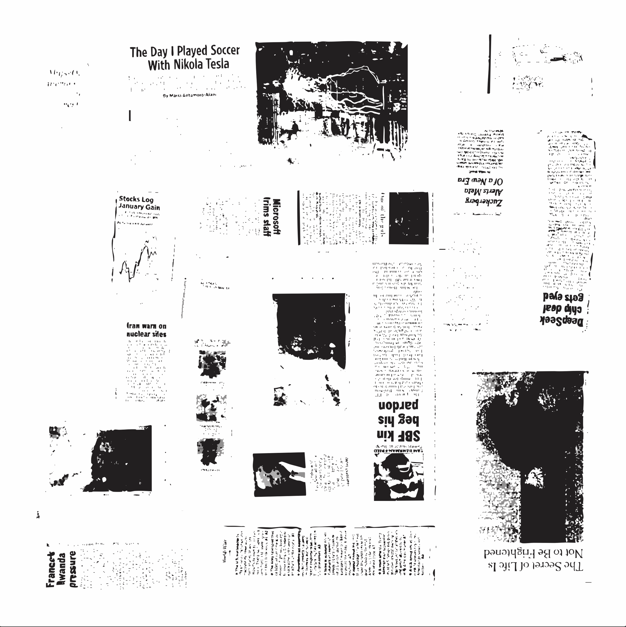
This was a failed experiment to try to same time by converting the entire design to ventors at once. You can see the distortion that takes place.
This screen test print was sent to me from the printer.
Bandana Research
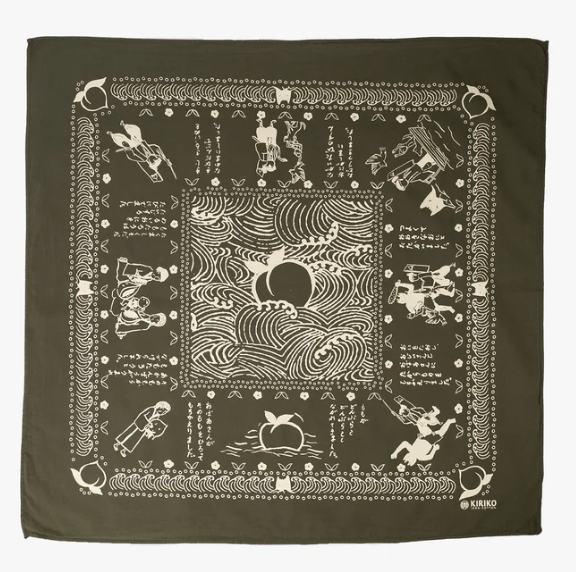
Green and White
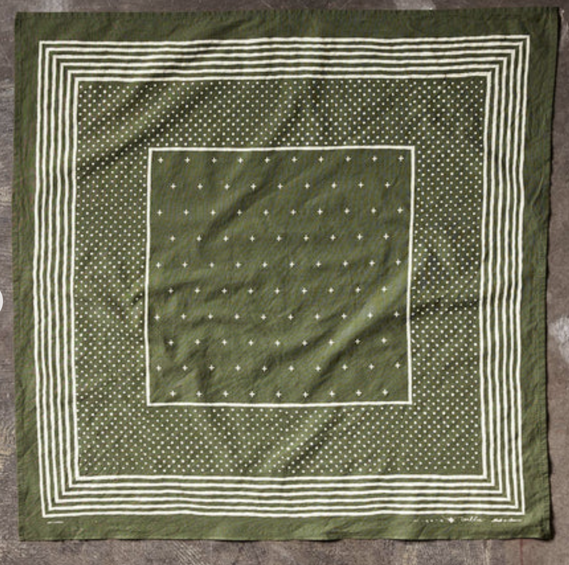
Green and White
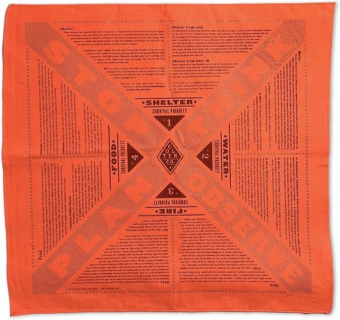
Dense text with concentric layout
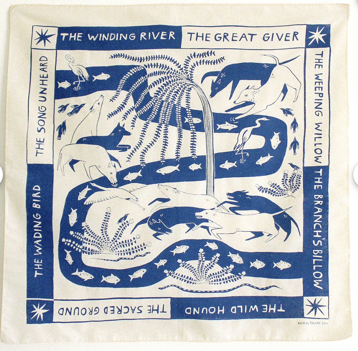
Text with color ink
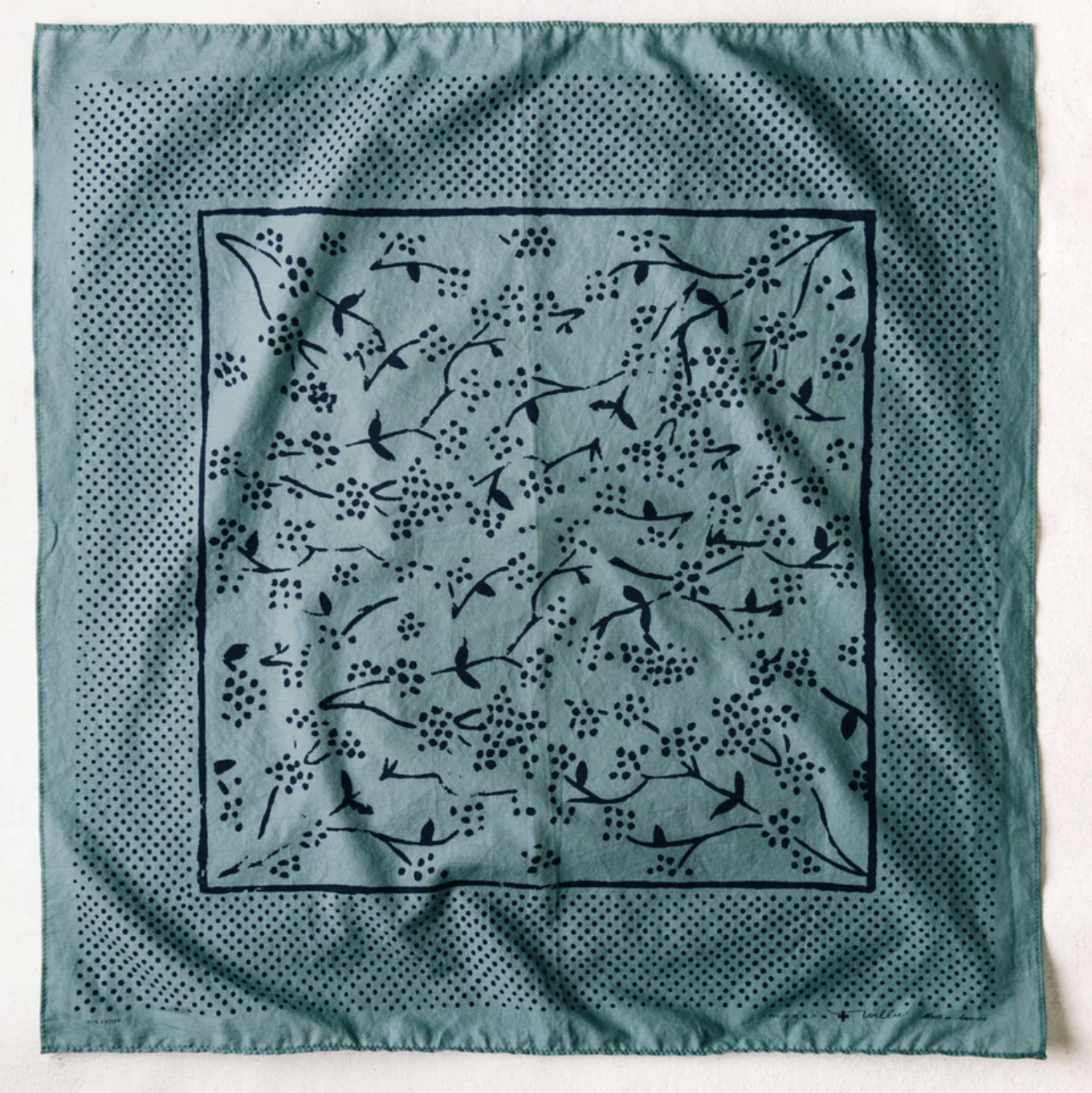
Boarder
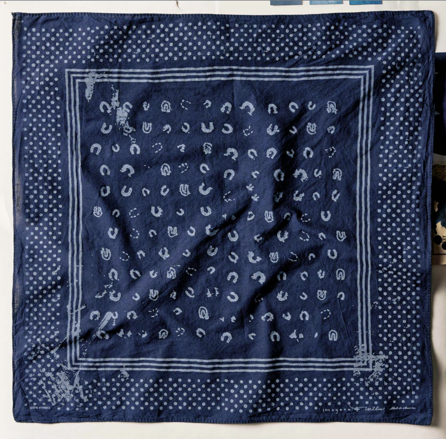
Blue and light blue